• Hello everybody! We have tons of new awards for the new year that can be requested through our Awards System thanks to Antifa Lockhart! Some are limited-time awards so go claim them before they are gone forever...

    CLICK HERE FOR AWARDS

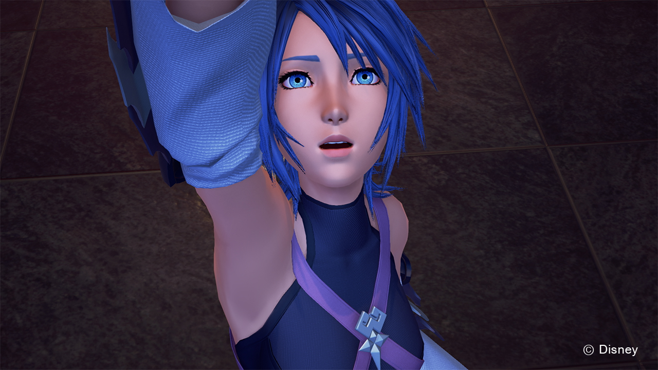
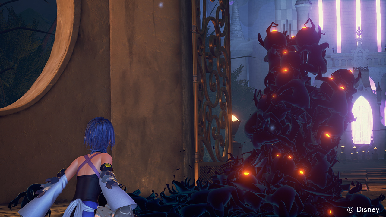
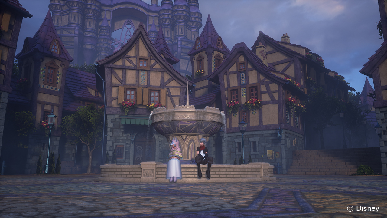
New Kingdom Hearts 2.8 Screenshots Show Off Unreal Engine 4


REGISTER TO REMOVE ADS
Status
Not open for further replies.

Chaser

Not KHI Site Staff
Staff member
Joined
Feb 19, 2008
Messages
23,732
Awards
70
Location
Australia

With the big media blow out for KINGDOM HEARTS HD 2.8 Final Chapter Prologue prior to E3, Square Enix has graced us with screenshots from the upcoming Playstation 4 game. The screenshots give us a good look at the updated visuals to KINGDOM HEARTS [Dream Drop Distance] HD, which was originally released in 2012 for the Nintendo 3DS which followed Sora and Riku as they traveled to brand new worlds in order to complete their Mark of Mastery examination.

However the glorious feature of the screenshots are certainly the visuals for KINGDOM HEARTS χ [chi] Back Cover and KINGDOM HEARTS 0.2 Birth by Sleep – A Fragmentary Passage – which have both been created using Unreal Engine 4, the same engine being used to create Kingdom Hearts 3.


Muke

whatever
Joined
Nov 30, 2014
Messages
6,118
Awards
39
Location
Vienna
Tell me Aqua's Model looks like plastic.
Go ahead. I'll laugh.
 

VoidGear.

red gay
Joined
Jun 6, 2015
Messages
5,594
Awards
57
Age
29
Location
Germany
Tell me Aqua's Model looks like plastic.
Go ahead. I'll laugh.

I suppose it's just still "new" for some people that they'll just look different than before, now in UE4. I'm absolutely happy with her face.
 

WastedPenguin

Member
Joined
Jun 10, 2013
Messages
123
Awards
3
Location
Heaven
Holy shit, now that looked pretty neat!
And im so glad that we get 2.8 in the end of this year plus new KH3 info in Winter (probably TGS).
Oh yeah i almost forgot........TERRA IS BACK BOYS!!!!!!
 
Joined
Jul 16, 2008
Messages
2,131
Awards
4
Age
33
Location
Tucson, AZ
People really need to stop complaining about the character models. I think in the back of their minds, they're still expecting them to look more realistic, even though Nomura clearly stated that's not what they're going for. It's still focused on keeping a cartooney style. I think once everyone understands that, they'll come to accept it.

I think the models look great!
 

gosoxtim

Silver Member
Joined
Jun 12, 2013
Messages
4,516
Awards
1
Age
35
Location
Illinois
Holy shit, now that looked pretty neat!
And im so glad that we get 2.8 in the end of this year plus new KH3 info in Winter (probably TGS).
Oh yeah i almost forgot........TERRA IS BACK BOYS!!!!!!
my guess playstion experince
 

VoidGear.

red gay
Joined
Jun 6, 2015
Messages
5,594
Awards
57
Age
29
Location
Germany
People really need to stop complaining about the character models. I think in the back of their minds, they're still expecting them to look more realistic, even though Nomura clearly stated that's not what they're going for. It's still focused on keeping a cartooney style. I think once everyone understands that, they'll come to accept it.

I think the models look great!

I actually think they look even MORE cartooney now than in earlier games. And I'm really happy with that. o.o
 

king_mickey rule

The Great Destroyer
Joined
Aug 31, 2007
Messages
4,159
Awards
9
Location
http://goo.gl/wqPLqi
I'm gonna take my comment from the other thread to here, to add to the discussion:

Guys, I think it's time to accept that the models look like that on purpose and it's Kingdom Hearts's style.

It never was before, though. Neither the Disney visuals or Final Fantasy visuals look like plastic. The lighting on Aqua's face, for example, is way too harsh, making her look all shiny.

Spoiler Spoiler Show


It looks plain wrong. Also, you can't have super-detailed clothing-textures and then have that kind of skin texture, without any detail whatsoever. Same goes for the textures on the hair. Why make the textures on the clothing super detailed, but keep the hair look like plastic?

This, on the other hand, looks nice.

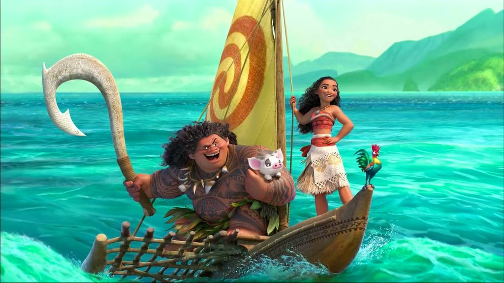
Notice how clothing almost never is an issue, but it's always the skin. To say they wanna create a cartoon-y look doesn't really help its case either. Let's take a look at some of the visuals from Disney's most recent movies:

Spoiler Spoiler Show


They don't look like plastic. Why? The skin has more details and colour variations and the lighting interaction is way softer. The hair is also way more detailed. Everything has enough details to not make it look like plastic, or clay.

The environments in the games look appropriately soft, same goes for the Heartless (the Shadows look amazing), but the character models are very problematic and inconsistent with the rest of the visuals.

Think it's safe to say they're having trouble here.
 
Last edited:

Launchpad

i remember the OLD khinsider
Joined
Jan 2, 2013
Messages
4,473
Awards
21
Age
28
Location
xigbar's apartment
People really need to stop complaining about the character models. I think in the back of their minds, they're still expecting them to look more realistic, even though Nomura clearly stated that's not what they're going for. It's still focused on keeping a cartooney style. I think once everyone understands that, they'll come to accept it.

I think the models look great!

I like em, but not everybody has to. Let people complain. :p
 

Chaser

Not KHI Site Staff
Staff member
Joined
Feb 19, 2008
Messages
23,732
Awards
70
Location
Australia
I'm happy with the ones presented in the trailer, I'm very happy with how the characters look now.

Flynn in DDD still blows me away
 

VoidGear.

red gay
Joined
Jun 6, 2015
Messages
5,594
Awards
57
Age
29
Location
Germany
Spoiler Spoiler Show


Btw I LOVE the glowing of the Shadows' eyes and how gigantic they are. This is plain awesome.
 

FFxStrife

New member
Joined
Mar 21, 2013
Messages
308
Age
29
Location
Brazil
Tell me that you share a different opinion than me.
Go ahead. I'll laugh.

And fixed.

I don't know why are there separate threads for the trailer and screenshots but I guess I'll talk about dem models here. Like others have said, they don't look bad but just different. I don't think much will change between now and December, so I'll just be happy with what we got.
 

Squood!

seibah
Joined
Oct 11, 2015
Messages
3,894
Awards
21
Location
Saberworld
I honestly never had a problem with the shiny models. They're shiny, so what? It's not the end of the world. Im just happy that we got to see Aqua
 

Lnds500

Bronze Member
Joined
Dec 20, 2007
Messages
1,507
Awards
4
Age
32
Location
Athens, Greece
Aqua looks much better but there is still room for improvement. Much better though that the previous 0.2 models
 

king_mickey rule

The Great Destroyer
Joined
Aug 31, 2007
Messages
4,159
Awards
9
Location
http://goo.gl/wqPLqi
To further my earlier point: they went from this, which genuinely looked like it came straight from a Disney movie:

Spoiler Spoiler Show


to this:

Spoiler Spoiler Show


The change of engine shouldn't change the visual style this drastically. Where there used to be consistency, there's now a very inconsistent look. If you look at other games that have similar graphics (or like I said before: current Disney movies), you'll find that the lighting on the character models is way softer than it is currently in Kingdom Hearts. I have absolutely no idea why they decided to go with this look.
 
Last edited:

Muke

whatever
Joined
Nov 30, 2014
Messages
6,118
Awards
39
Location
Vienna
^
Except one is In-Game and the other is a Render.
Also, how has the artstyle changed? I don't get it
 

Lnds500

Bronze Member
Joined
Dec 20, 2007
Messages
1,507
Awards
4
Age
32
Location
Athens, Greece
To further my earlier point: they went from this:

Spoiler Spoiler Show


to this:

Spoiler Spoiler Show


The change of engine shouldn't change the artstyle this drastically. Where there used to be consistency, there's now a very inconsistent look.

The Sora picture though is not real-time, I doubt it is in-engine as well. It's a render.

A use of D23 footage would be more appropriate and Sora still looks much better there.

There is a very specific spot in the Tital/Train ride sequence where SDG look amazing, in complete harmony with the environment and the lightning is sublime. I mean to do a gif of that scene when I can.
 
Status
Not open for further replies.
Back
Top