- Joined
- Nov 1, 2009
- Messages
- 17,750
- Awards
- 36
The NEO: The World Ends With You's Official Guidebook + Setting Documents Collection includes a selection of artwork and development materials with creator comments to accompany them. Check them out below!
Creator comments by Tetsuya Nomura (Creative Producer & Character Designer), Gen Kobayashi (Character Designer), Miki Yamashita (Character Designer), and Sayoko Hoshino (Art Director).
WARNING: There are major story spoilers. Do not continue if you wish to not be spoiled about the characters, enemies and events that appear in the game.
.
.
.
.
.
.
.
.
.
.
SPOILERS BELOW
CHARACTERS
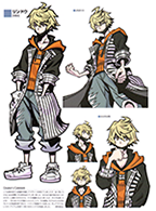
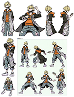
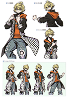
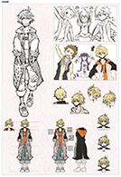
Nomura: I'd been imagining and designing a potential sequel for several years, but when the time finally came, I actually had no idea what to do [with the protagonist]. The team was frustrated because I didn't even start drawing; I'd gotten some rough suggestions but still couldn't come up with anything concrete... I guess that's just goes to show how strong Neku's design was. Around that time, I looked around on social media to see what sort of casual outfits young models were wearing, and an image began to solidify in my mind. I added a key item - a mask - and in the blink of an eye, Rindo's design came together.
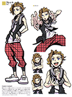
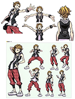
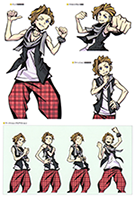
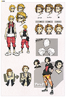
Kobayashi: Fret was the first design I started working on, so I remember it taking some time to figure out what he was like. Initially, I had the impression that the setting would require him to be a bit more serious, so I had an image of him with black hair or wearing glasses. After reading the updated scenario and discussing with the team, we settled on the current look. It's not very noticeable, but the cap hanging off his pants is a key point.
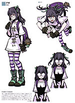
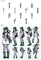
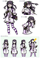
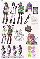
Yamashita: I was initially planning to do a more mature take with the request for a "delusional otaku girl who is overly devoted to her fave". Since we've established that her fave bears a resemblance to Minamimoto, I discussed it with the team and came up with the idea of an ita-bag highlighting that character. We ended up adopting it and wound up with a design filled to the brim with otaku paraphernalia. This was the first time I was able to participate in the creation of my own character, so I was absolutely thrilled. I'm deeply attached to her.
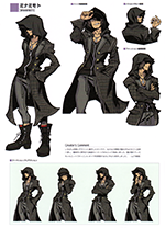
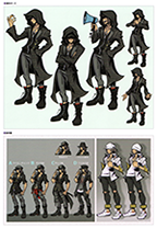
Yamashita: This was the first character I started designing. I struggled a lot to get the right feel for him but was finally able to complete the design after Nomura provided me with an image for his outfit. Even though his face is hidden, I still had a hard time expressing his cool aura through his silhouette.
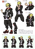
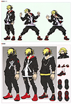
Kobayashi: Beat's image has changed quite a bit since the previous game due to his role of being mistaken for Neku in the story. I started with a very Neku-esque design since we had initially planned for Beat to be dressing up as Neku himself. Ultimately that was no longer the case, so I decided to proceed with the current version. The headphones are a remnant of the original concept.
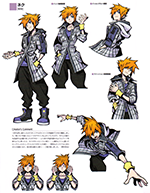
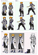
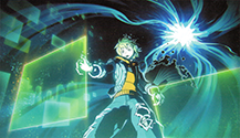
Nomura: This was quite a difficult task because Neku had looked the same for 14 years; the image of him in his original design was just too strong. We'd already established a design for Beat disguised as Neku, so I had to avoid clashing with that. I thought about using a hood to conceal his face, but that was already done by both Minamimoto and Beat... I could lengthen his coat to differentiate him from Beat, but then he'd just overlap with Rindo and Minamimoto instead... Using the original color scheme made it appear too plain, and alternative colors were already used by other characters... Needless to say, there was a lot of back and forth.
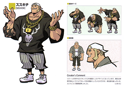
Kobayashi: I designed him with a monochrome theme based on his love of Reversi. At first, I was going to give him a beautiful outfit due to his position as a Shinjuku Reaper, but since he's posing as a Player, I decided to change course.
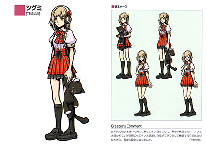
Nomura: When I drew her a few years ago, it was with the assumption that she would be the new heroine. With our concepts for Shinjuku, I thought it would work better as a bluff if people thought she was the heroine from the Shinjuku side of the story, which isn't depicted. So here we are.
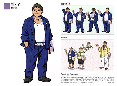
Kobayashi: I designed Motoi with the image of an "IT venture company president" in mind. On the surface, he's always smiling and positive, but behind the scenes, he's not afraid to kick people down, so it was fun to illustrate this gap in his personality. There's something about him that you just can't hate.
Yamashita: Kobayashi originally designed this character to be a Shinjuku Reaper, but she was suddenly replaced by Ayano as the older sister figure for the Players, resulting in this design. I tried to make her sexy, but not overtly revealing. The illustrations Kobayashi drew for the event scenes are cute and flirtatious, making this playful woman my Number One.
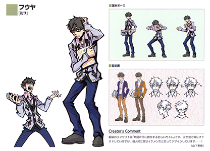
Yamashita: The concept of his outfit was "an old man strolling around with a map in hand." He's a crybaby and always nervous, but I think he's actually a handsome guy.
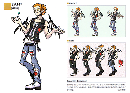
Yamashita: I decided not to change much of his image from the previous game and left the more impressive aspects of his design intact. The addition of the pelvis under the ribs is a particular point of interest.
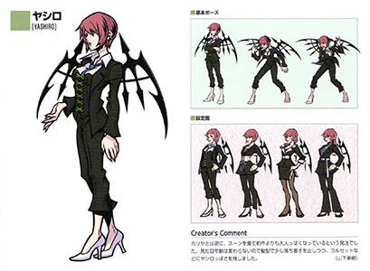
Yamashita: Unlike Kariya, I was asked to give her a suit and make her look more mature than in the previous game. Her physical age hasn't changed, so I used her hairstyle to make her look more composed while retaining signature elements such as her corset.
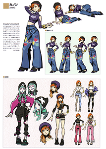
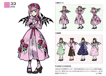
Yamashita: This character used to be decked out in Harajuku-style fashion from head to toe, but I proposed that she adopt princess-style this time around. Nomura advised me to really push it in this direction, so I went all out.
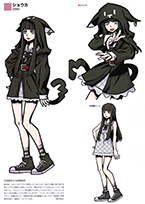
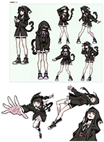
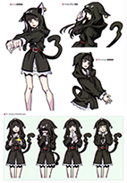
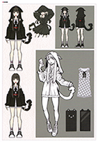
Nomura: A few years ago, I had envisioned Tsugumi as the heroine, but by the time I started working on the project again, her role had changed. I thought about a new heroine with conflicting looks, someone who could be connected to Shiki through a shared icon. Tsugumi already had the Mr. Mew plushie, so I decided to incorporate his design into Shoka's hoodie. I was conscious of her Jirai-style appearance, but it ended up working out once I learned about her Reaper background after completion.
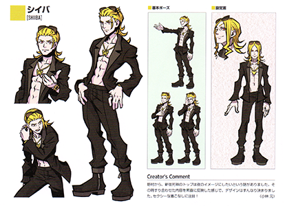
Kobayashi: Nomura told me he wanted the top-ranking Shinjuku Reaper to have the image of night. This design is a straightforward reflection of what we discussed and was completed quite easily. Behold his sexy outfit!
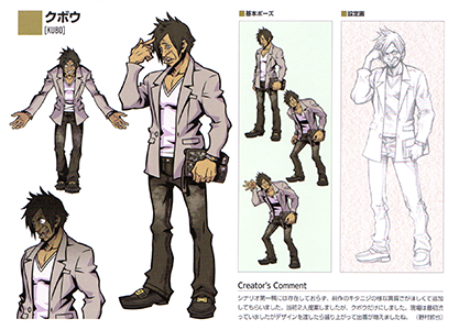
Nomura: This character didn't exist in the first draft of the scenario, but I wanted a more divergent character like Kitaniji from the previous game, so I had him added. I'd actually proposed 2 characters initially, but decided Kubo would be enough. The staff was reluctant at first, but once I submitted the completed design, they got really excited and began to incorporate Kubo more and more.
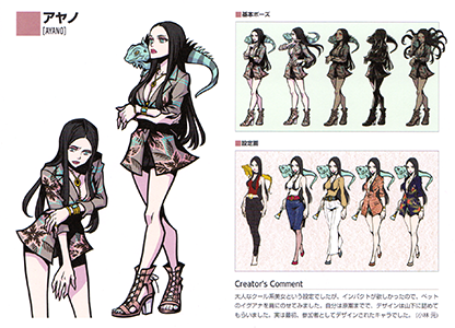
Kobayashi: She was established as a cool, mature beauty, but I wanted something of impact, so I put a pet iguana on her shoulder. I only worked on the draft, while Yamashita finalized the design. Actually, this character was originally designed to be a Player.
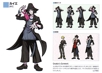
Yamashita: Since he's a fortune teller, I initially just gave him a straightforward design with some tarot cards. It ended up being too plain, so I added power stones, a pointed hat, and gave him a smartphone with a character-themed case.
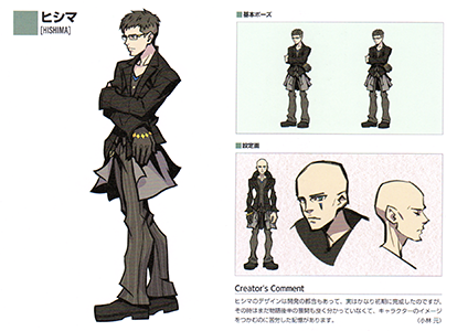
Kobayashi: Hishima's design was completed pretty early on due to the ease of development, but by that time, we actually hadn't even figured out what was going to happen in the second half of the story. I remember having a hard time grasping his character as a result.
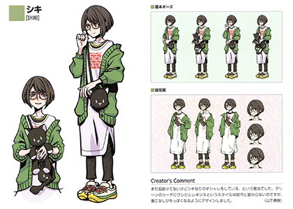
Yamashita: I was asked to make Shiki look fashionable in her own right, though not yet sophisticated. This style with the green cardigan, one-piece, and leggings hasn't changed from the previous game, but I designed it to look more modern.
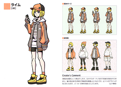
Yamashita: Rhyme was to be designed in the vein of an innocent, young actress. Since her original design is quite sporty, I decided to keep the same style and made her look more wholesome by tousling her hair. Beat's design was completed first, so I drew the pattern on Rhyme's hoodie to match.
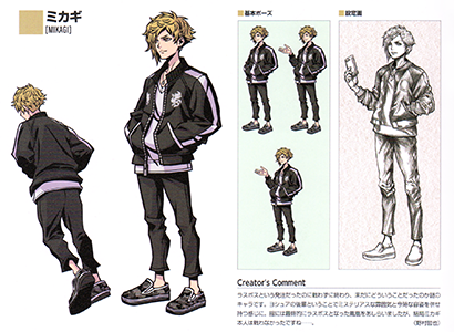
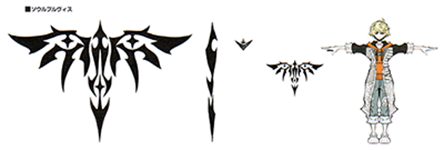
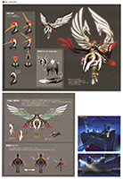
Nomura: Even though the request was for the last boss, he wound up not fighting at all and ultimately remains a mysterious character. As Joshua's junior, he has a mysterious aura and a modern appearance. His clothes are embellished with the phoenix that became the final boss, but Mikagi himself never fought in the end...
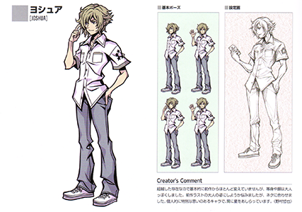
Nomura: Since he's a transcendent being, I didn't change much from his previous design and just made his face and body more mature. I had a hard time figuring out whether to go with his adult form from the conclusion to the original game, but I decided to have him match with Neku instead. This character has a special place in my heart, and is adorned with stars on his shoulder.
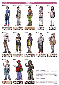
Kobayashi: The people of Shibuya are made up of all sorts of colorful, new characters. Ken Doi, a returning character from the previous game, has also changed his outfit and gone from a ramen shop to a curry shop, so be sure to check it out!
Yamashita: I designed Itsuki, Honoka and Eiru freely, as if they were real people. The unique Players (and store clerks) were designed by h.a.n.d.
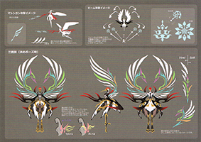
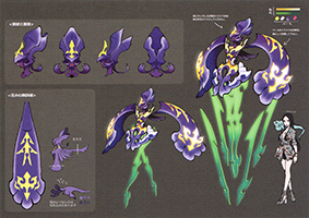
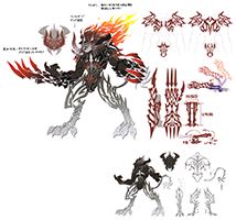
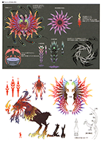
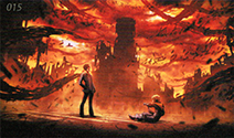
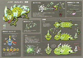
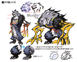
BOSS NOISE
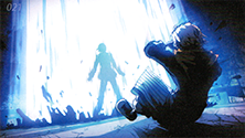
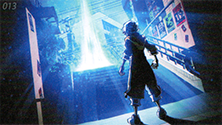
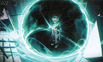
MOVIE CONCEPTS
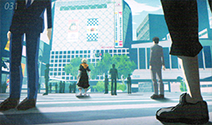
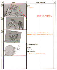
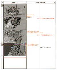
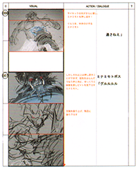
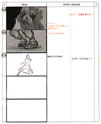
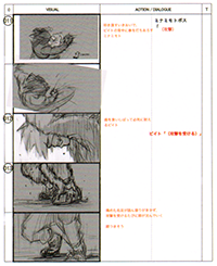
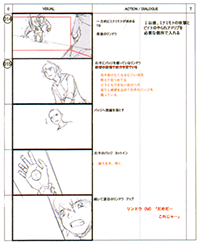
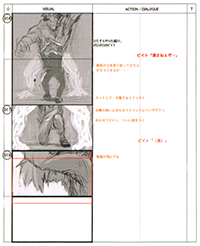
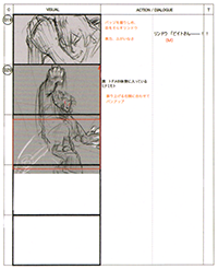
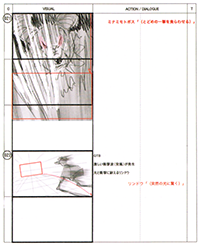
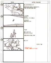
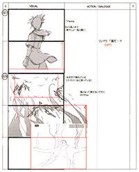
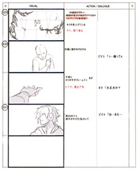
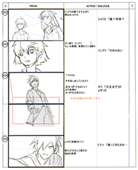
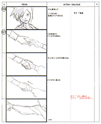
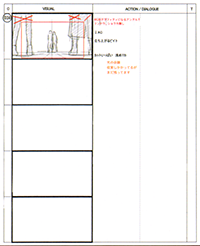
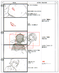
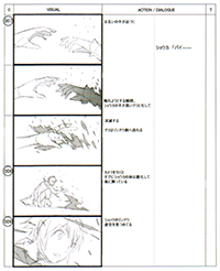
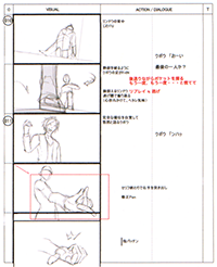
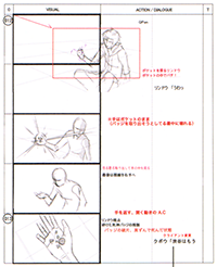
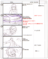
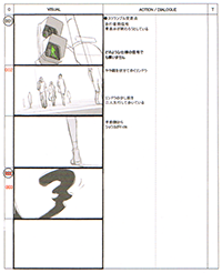
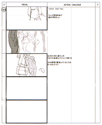
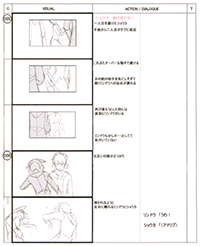
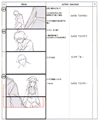
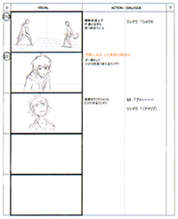
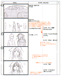
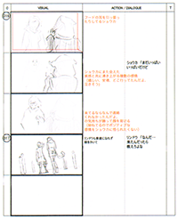
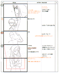
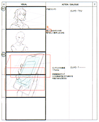
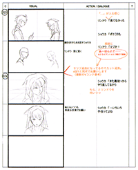
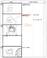
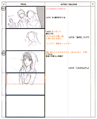
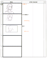
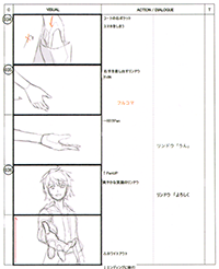
STORYBOARDS
ART COLLECTION
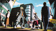
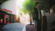
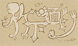
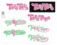
Hoshino: We created a large number of illustrations to fit into the world. There were also a lot of rejected ideas! The area logo was hand-drawn, with respect to the original game. If you look closely, you can see the artist's signature on the dragon scroll hanging in the Ryu Gu store!
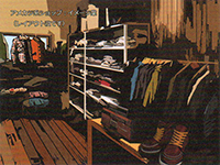
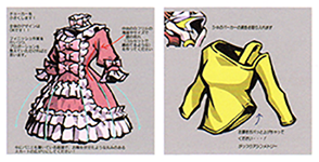
Hoshino: Each brand follows a completely different trend, so it was fun to come up with all the outfits. The process of understanding the concept and creating the products made me feel like I was working for an apparel company! The designs, including that of food and items, are consistent with the character illustrations.
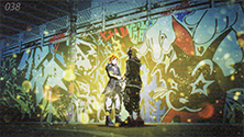
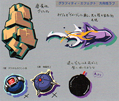
Hoshino: Psychs are expressed through graffiti art. It was extremely difficult to express these illustrations with depth in 3D, so we tried to create a similar effect by selecting motifs and using colored drop shadows.
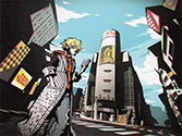
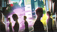
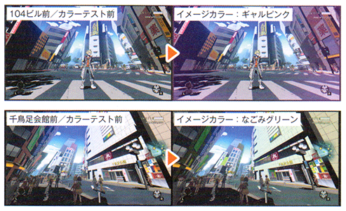
Hoshino: This depicts the color image that characterizes each area. In order for players to recognize the differences between similar-looking streets, we utilized a uniform color image for things like asphalt, outer walls of buildings and signs for each location.
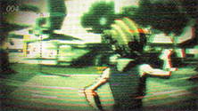
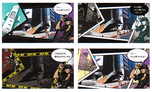
Hoshino: This is an early proposal for a patterns designed to express the 3D control screen like a comic. Other proposals included lighting the 3D side and animating the inside of the panels. I spent a lot of time on the prototypes because it was important to make the dialogue legible.
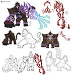
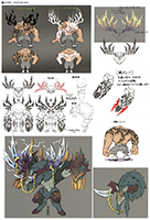
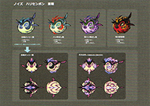
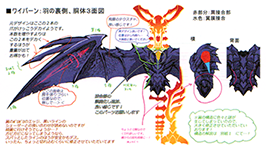
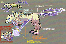
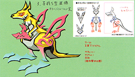
Hoshino: These materials are from back when we were trying to figure out how to approach deforming the 3D models for Noise. The bodies and faces are sculpted with animals in mind, but the glowing tribal patterns look like flat images with no shading or depth. There are some pretty wild ideas!


