We hope you are all enjoying the user-submitted editorials written by our very own forum members and site readers! Today we have Rydgea reviewing the brand new KINGDOM HEARTS FINAL MIX manga that have been retranslated and published by Yen Press!
Hey Kingdom Hearrs fans, Rydgea here! Thought I'd share a briefing on my initial experience with the subject matter. I haven't read any manga in a while, and this was clearly an opportune time to revisit Shiro Amano's first frolic with our heroes and, as I've never purchased comics from them before, get a feel for how Yen Press operates. With a refreshing trip down memory lane in store and more Kingdom Hearts material to satiate my fandom until Kingdom Hearts HD 1.5 ReMIX arrives, I leapt at the opportunity to pick this up and share a few of my impressions.
Let me preface this by saying I'm not sure how true to the original printing format this constructed KHFM is to Japan's release, and since Tokyopop's run is the only standard I have to go by it will be used for this comparison. Also, just to emphasize this is a comparison of technicalities, for the sake of prospective buyers of this new edition, and it is not a review of the plot, characters, artwork, etc. It's pretty nit-picky, and if I ever had any bias it was put in check, as I haven't read the Tokyopop edition of Kingdom Hearts since '06 or '07. Note that I've only read the first four chapters of the Yen Press run, and thumbed through the book for other details to compare. Also note, the photos represented were taken in a naturally lit area with no flash, reduced in size and cropped only to compensate the forums, however, no manipulation was used. So with that in mind, let's get started.

• DISPLAY
Let's start with what's right in front of us. Yen Press's KHFM and Tokyopop's KH are very close to the same height and width, Tokyopop's being just millimeters shy of equal proportion. So, for example, let's say that you had previously purchased volumes one and two of the Tokyopop edition and only needed the second KHFM omnibus, they would look nice standing side by side or stacked on top of eachother. Granted the spines put a damper on it looking uniform, but for those not OCD, this is perhaps more than coincidence.
• LAYOUT
There's a trim for the header and footer on every page in Yen Press's printing, and it's a little annoying if not plain unnecessary. I know for novels this is standard, but with comic books I want to see the art, and here the indentions just seems to be taking up space. At the top it's coupled with a checkerboard pattern, which is a little distracting. I'm sure these minute intricacies will eventually be overlooked once the eye is trained and you're engrossed in the read, but I haven't reached that point yet.
Some of the page dividers which usually showcase more meticulous imagery of Amano's choosing (the very detailed, shaded items like a pair of goggles, a paopu fruit, a magic lamp, etc.) had randomly picked art from previous panels that had no effects to make it look seamlessly implemented like the rest. In fact, some were cut off and one had a sound effect attached to it. I gagged. I would have preferred a blank page.
• IMAGE QUALITY
Looking from one edition to the next, I noticed Tokyopop ironically had larger but cropped artwork. As stated earlier I have no way of telling what the aspect ratio for the Japanese releases were, but Yen Press gave us what I can only hope was the whole picture, even if it was condensed. It's always upsetting to me when the artists work is cut short, but since I was doubting Tokyopop for the scaling, I assumed they had compressed the picture as well when I came across, even more surprisingly, some distortion issues. Yes, either Tokyopop squashed the artwork in their run, or Yen Press stretched it out in theirs.
The paper quality, texture, and bond are fairly similar in both versions, and I didn't find any transparency. Both were comfortable to the touch, but Tokyopop's pages looked yellowed next to Yen Press's clean, white sheets and the weight of the omnibus nestled smoothly in my hands.
I'm not sure what happened but after the first set of color pages, the brightness and contrast reverses noticeably. This is a good thing for Yen Press because everything becomes clearer and details more vivid albeit grain and ribbing from printing becomes slightly more pronounced. Tokyopop's press seemed to blend the toner better. While it's still an improvement for Yen Press, this changes again in volume two where everything is drastically darker and the some art is washed out in the void.
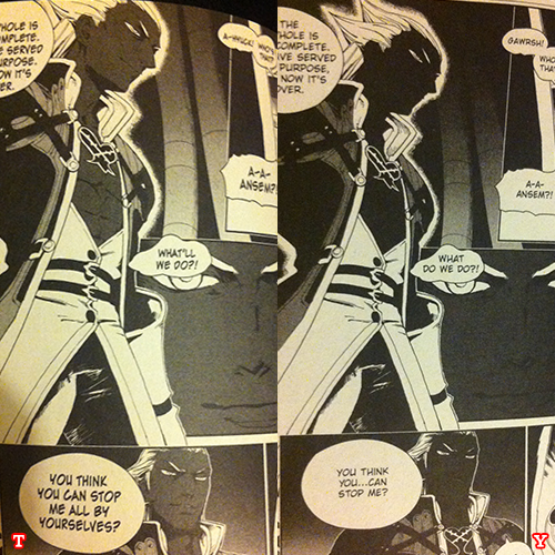
I've included several labeled comparisons in this article to give you a reference for some of the things I mention.
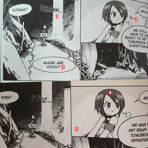
1) Y: English sound effects replacing Japanese ones entirely
2) Y: I noticed a lot of extra vowels and elipses, and I'm wondering how literal a translation those are.
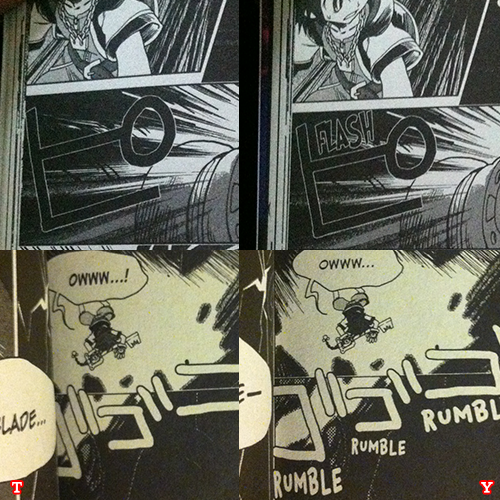
3) Y: Did they just add a sound effect where there was none?
4) T: Kairi's head looks squashed here. Like Stewie or Arnold, she has the football-head thing going on.
5) T: There's a manilla tint to the paper.

• EDITING
In the Yen Press editions the text itself is generally nicer to read, the fonts looking more classy, and the kerning spaces the letters out more, making it easier to read. I have to mention that it does read from left to right, so those expecting an authentic manga experience might feel snubbed once again.
• TRANSLATION
Here is where this review falls short. I can't judge how accurate either translation is. I do know most of us would prefer literal translations versus pulling stuff out of thin air, fabricating a line here and there to make it roll off the tongue or dumbing down the inside joke for the audience's sake. What I read I did enjoy. Interchangeably I liked how things were worded, but I have no idea how this was handled or how faithful translations they are. So, here's some dialogue I extracted for comparison:
Sora
T: "This is Riku's and my secret place!"
Y: "This is our secret place - just me and Riku!"
Honestly, both of these lines sound a little awkward, but I prefer the Yen Press verbiage. Sometimes you get the feeling both companies took liberties with their familiarity of the game script, but neither translation is consistent:
Ansem SoD
T: "You know nothing. You understand nothing."
Y: "Yes...You do not yet know anything-"
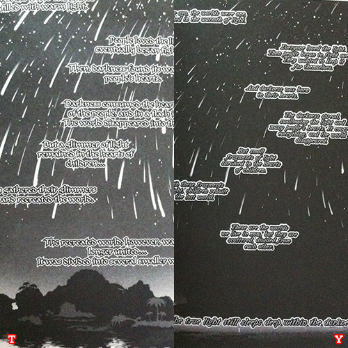
Kairi's Grandmother's Tale / Narration
T: "People loved the light, and eventually began fighting over it."
Y: "Everyone loved the light. Then people began to fight over it. They wanted to keep it for themselves."
The Japanese sound effects retained in the Tokyopop edition are replaced with English sound effects if possible, but sometimes there were limitations where they failed to remove them and so you have double the sound effects taking over the page and it looks really cluttered and, again, inconsistent. My personal preference is to preserve the original presentation and have a sound effects glossary at the back, but it is convenient for those who can't be bothered.
• BONUS MATERIAL
With Final Mix, you get the ever adorable Kingdom Bites comic strips, plus a new bonus episode and a special short not released in the Tokyopop localization! But there is a rough sketch gallery found in the Tokyopop version not present in this one. Since the first omnibus had a color page which was the front and back cover of volume two, I expected the second to have a color page for volume three. To be honest, I was suprised by the lack of color pages and the general treatment of the color pages in this newest compilation. Some of them looked extremely muddy, and it's a real shame.
In conclusion, it's Kingdom Hearts. What else can I say? I know I'll have fun reading it, and I can't wait to finish this new set in its entirety and let it fully sink in. There are definitely enjoyable aspects provided by both publishers, and at this point in time, it's too early for me to choose a quintessential edition. I do hope the other Kingdom Hearts books are put to bed with consistent care and plenty of frills!
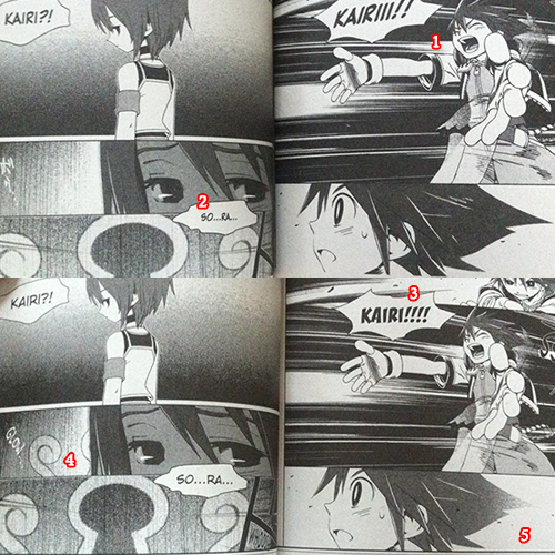
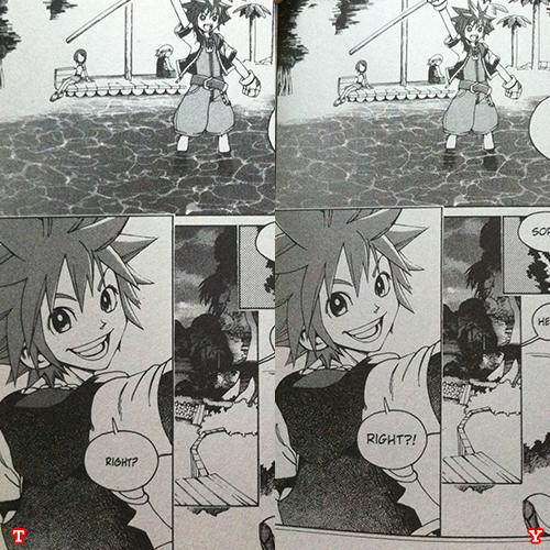
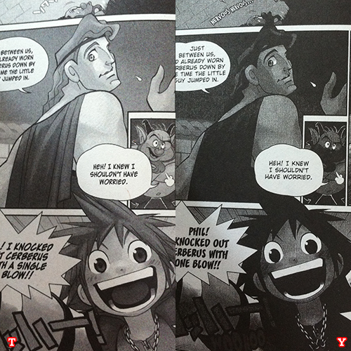
1) T: Again, I see some sort of warping, widening Sora's body.
2) T: While still decipherable, the text is not as clear as Yen Press's.
3) Y: You get an abundance of exclamation points or vowels, which edition holds true?
4) Y: Did they take the liberty of copying and pasting the keyhole behind Kairi?
5) Y: Sora's hair fades into oblivion. Added for dramatic effect or not, I want to know if this is how it was overseas.
With that what are your thoughts on the Kingdom Hearts Final Mix manga? Did you enjoy it? What did you think of the changes? What are your expectations for the rest of Yen Press's scheduled lineup?


